Why business people need data visualization
Vector business chart of financial statistics. Source: Shutterstock
Business people love to use Word documents, PowerPoint, spreadsheets, diary/calendar applications (business folk love meetings, after all), project management planners and sometimes a few semi-sophisticated publishing tools to create more documents (which are always useful at meetings, right?)… and that’s about all they need these days.

The above statement almost made it but blew it at the last moment.
Businesspeople do need all those tools (some would go into a cold sweat if they lost access to PowerPoint), but today they also need something else… they need to welcome data visualization tools into their app arsenals.
What is data visualization?
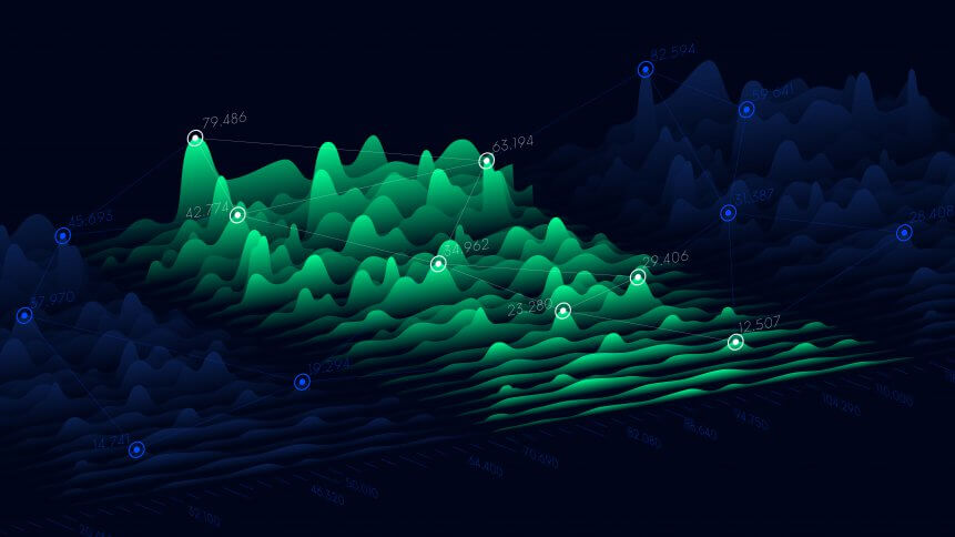
In simple terms, data visualization is the graphical representation of information and data using graphs, charts, diagrams and other forms of pictorial ‘schematic’ representations.
It is a general umbrella term used to describe a growing set of IT industry tools and platforms dedicated to showing non-technical (and technical) business stakeholders what the ‘shape’ of data they are working with really looks like.
Going rather beyond the basic graph output functions of your Excel spreadsheet, data visualization is the bread and butter underlying technology behind the process that we have all come to know as business intelligence (BI).
As BI is an integral (and in many cases formative) part of many contemporary enterprise resource planning (ERP) platforms, businesspeople have become more and more heavily exposed to its tools and functions, with data visualization being one of the most tangible hands-on, eyes-on functions.
Hands-on & eyes-on
We said hands-on and eyes-on functions; but really we should say eyes-on, then hands-on functions.
Good data visualization tools will allow businesspeople to not only view information on graphs and charts as part of ‘dashboards’, but they will also allow users to move sliders, pointers, gauges, etc., and actually affect and impact the way operations are being executed inside the enterprise.
These can be direct ‘live’ actions, or experimental test actions designed to assess the likely impact of any individual or collected group action on the data being presented.
Good data visualization tools will also allow businesspeople to identify patterns, trends, and correlations that might have otherwise gone undetected in raw information streams or in text-based data.
When artificial intelligence (AI) augments this aspect of data visualization technology, then we start to get to a new level of autonomous business where some decisions are carried out automatically.
What is advanced data visualization?
Coming full circle on this discussion— and if we accept that data visualizations tools have indeed become part of the business app selection pack— then we should also look forward and ask what we mean by advanced data visualization.
YOU MIGHT LIKE

Is small data the key to unlocking your big data?
Currently, at the still-nascent emerging edge of the wider data visualization market, advanced data visualization techniques occur when the business starts to not only number crunch through the information in its core IT stack, but also include autonomous (or semi-autonomous extrapolation and examination) of data from machines.
We’re talking about AI again and this time at its intersection with the Internet of Things (IoT).
Business action recommendations
When we can start to engineer these previously untapped information streams into our data visualizations, then (in theory at least) we can start to uncover more insight into the way business operations should run. We can also make wider and deeper predictions and business action recommendations.
There is a huge amount of so-called big data now being produced, structured into meaning and stored, but if we fail to actually look for patterns in the data pool, then we will fail to visualize from the virtualized underbelly.
We’re not there yet and you can still play with your PowerPoint-cum-spreadsheet planning strategy if you wish, but the BI-enriched data visualization market is growing and could end up in a meeting presentation near you soon.

5 March 2024